The world of web development is in a constant state of flux, with new technologies, frameworks, and methodologies emerging regularly to meet the ever-changing demands of the digital landscape. Among the most significant trends in recent years is the rise of Pxless design — a revolutionary approach that seeks to eliminate the rigid use of fixed pixel values in favor of more flexible, scalable design principles. In this article, we will explore the meaning of Pxless, its advantages over traditional pixel-based layouts, and its implications for the future of web design.
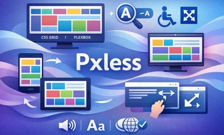
What is Pxless? A Modern Design Philosophy
At its core, Pxless refers to a design philosophy that moves away from pixel-based measurements in favor of relative units such as percentages, em, rem, and viewport units (vw, vh). Traditionally, web design relied heavily on specifying exact pixel values for elements like fonts, margins, padding, and container widths. While this provided pixel-perfect control over the layout, it also created limitations in terms of responsiveness, scalability, and accessibility.
Pxless design, on the other hand, embraces a more flexible approach, allowing elements on a webpage to scale proportionally to the size of the screen or viewport. Instead of locking the layout into fixed dimensions, Pxless allows for fluid, adaptive, and dynamic designs that offer a more intuitive and consistent user experience across different devices.
The Rise of Responsive Design
The concept of Pxless is closely linked to the broader movement of responsive web design, which aims to create web pages that adapt seamlessly to various screen sizes and devices. With the increasing use of smartphones, tablets, and other portable devices, the need for websites that look great and function properly on all screen types has never been more critical.
Responsive design relies heavily on flexible units and media queries to adjust the layout based on the device’s screen width. While media queries can still be used in Pxless design, the emphasis is placed on relative units that scale dynamically rather than predefined pixel sizes. This results in a design that remains consistent and functional across a wide range of devices without the need for excessive breakpoints or hard-coded adjustments.
The Core Principles of Pxless Design
To fully understand Pxless and its benefits, it’s essential to examine the fundamental principles that define this approach to web design. Here are some of the key concepts that guide Pxless design:
1. Relative Units vs. Fixed Pixels
The most significant shift in Pxless design is the move away from fixed pixel values. Instead of using pixels (px) to define the size of elements, designers use relative units such as:
- em and rem for typography (font sizes).
- % for widths, heights, margins, and padding.
- vw and vh for viewport-based dimensions (relative to the screen size).
By using these relative units, elements become more adaptable to different screen sizes, user preferences, and even browser zoom settings. For example, a font size set in em will adjust based on the font size of its parent element, allowing text to scale proportionally as the user changes their browser settings.
2. Fluid Layouts with CSS Grid and Flexbox
Another key principle of Pxless is the use of modern layout systems like CSS Grid and Flexbox. These CSS modules provide powerful tools for creating responsive, flexible layouts without the need for fixed pixel values. CSS Grid allows designers to create complex two-dimensional layouts that automatically adjust to different screen sizes, while Flexbox offers a more streamlined approach for building one-dimensional layouts that can adapt based on available space.
Both of these systems rely on relative units to define the size and position of elements, further supporting the Pxless philosophy. With these layout techniques, web designers can create fluid, responsive designs that adapt to the size of the screen, without the need for manually adjusting pixel values for each breakpoint.
3. Mobile-First Design
Mobile-first design is another essential principle in Pxless design. Since mobile devices have become the primary way many users access the internet, designing websites with a focus on smaller screens first ensures that the design is optimized for mobile users before scaling up to larger screens.
This approach encourages designers to prioritize the most critical content and features, ensuring that users on any device can access the core functionality of the website. By starting with a mobile-first mindset, designers are more likely to create websites that scale gracefully across various devices without the need for excessive media queries or breakpoints.
4. Accessibility and User Preferences
One of the key advantages of Pxless design is its ability to enhance accessibility. With fixed pixel values, users with visual impairments or those who need to zoom in on a webpage may find that the layout breaks or becomes difficult to read. By using relative units, Pxless ensures that the layout remains flexible, even when users change the default font size or zoom in on the page.
Additionally, the Pxless approach allows for better responsiveness to user preferences, such as adjusting text size or other visual elements for improved readability. This not only enhances the user experience for people with disabilities but also ensures that all users have control over how content is presented.
The Benefits of Adopting Pxless Design
The adoption of Pxless design principles offers numerous benefits for both web designers and users alike. Some of the most notable advantages include:
1. Improved User Experience Across Devices
By eliminating fixed pixel values, Pxless designs automatically adjust to different screen sizes, ensuring a consistent and optimal user experience across smartphones, tablets, desktops, and even larger screens like smart TVs. This approach eliminates the need for separate mobile and desktop versions of a website, making the design process more efficient and cost-effective.
2. Simplified Maintenance
In traditional pixel-based design, maintaining a website across multiple devices can become a complex and time-consuming task. With Pxless design, the use of relative units and fluid layouts reduces the need for extensive media queries and breakpoints. As a result, websites are easier to maintain and update, and changes can be made more efficiently without worrying about breaking the design on different devices.
3. Future-Proofing Your Design
With the rapid advancement of technology and the emergence of new devices, Pxless design ensures that your website remains adaptable to future screen sizes and resolutions. Whether it’s foldable smartphones, high-DPI monitors, or virtual reality interfaces, Pxless design allows for a level of scalability that future-proofs your website for upcoming technological innovations.
4. Better Accessibility and Performance
By focusing on relative units and responsive design principles, Pxless helps improve website accessibility, particularly for users with disabilities. Additionally, using flexible units and modern layout techniques can lead to faster load times and improved performance, as the design adjusts to different screen sizes without requiring additional resources for different layouts.
Implementing Pxless in Your Web Design Workflow
If you’re ready to adopt Pxless design for your next project, here are some practical steps to get started:
- Start with a Mobile-First Approach: Focus on designing for smaller screens first, ensuring that your content is accessible and usable on mobile devices before scaling up for larger screens.
- Use Relative Units: Replace fixed pixel values with relative units such as em, rem, %, and viewport units for better scalability and flexibility.
- Leverage Modern Layout Systems: Use CSS Grid and Flexbox to create responsive, flexible layouts that automatically adjust to different screen sizes.
- Test Across Devices: Regularly test your design on various devices to ensure that it looks and functions as expected, regardless of screen size or resolution.
- Ensure Accessibility: Consider how your design will respond to different user preferences, such as text size and zoom settings, to improve accessibility for all users.
Conclusion: Embracing the Future of Web Design with Pxless
In conclusion, Pxless represents a significant shift in the way we approach web design, moving away from rigid pixel-based layouts toward more flexible, scalable, and user-friendly designs. By adopting Pxless principles, web designers can create responsive, adaptive websites that offer an optimal user experience across devices, improve accessibility, and ensure that designs are future-proofed for emerging technologies. As the digital landscape continues to evolve, embracing NEWSZ will be essential for building websites that meet the needs of modern users.